

The Witch thrives on its damning details. It seems authentically claustrophobic and austere. Threats to faith take their toll. The untouched surroundings and natural lighting allow each period detail revelrous moments of impact. Each is emboldened by the sharp focus of the picture: accents, interiors, beliefs, clothes. Clothes of the time are recreated meticulously and deserve much consideration. In a tangled forest, the straight piping on a child’s jacket is our eyes’ only source of order.
* * *
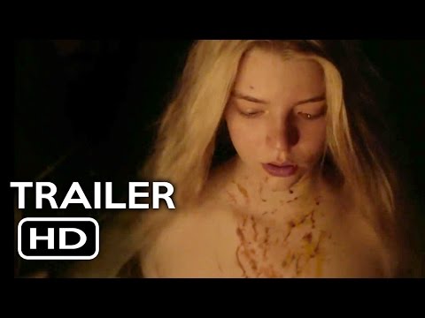
The events of The Witch, Robert Eggers’ acclaimed psychological horror picture, take place sixty years prior to the eradication of Satan’s workshop in Salem. The film follows William, his wife, and offspring, Puritans all, searching for a second beginning in New England. Freshly spurned by colonial neighbors for his religious arrogance, William and his family find a clearing in between a snarl of woods. Soon after settling in, the family is gripped by the diabolical.
The Witch thrives on its damning details. It seems authentically claustrophobic and austere. Threats to faith take their toll. The untouched surroundings and natural lighting allow each period detail revelrous moments of impact. Each is emboldened by the sharp focus of the picture: accents, interiors, beliefs, clothes. Clothes of the time are recreated meticulously and deserve much consideration. In a tangled forest, the straight piping on a child’s jacket is our eyes’ only source of order. The clothes are a wonder to behold.
These costumes were crafted by Linda Muir, who was kind enough to discuss her exhaustive research and designs with me. The Witch was released on DVD and Blu-ray in the United States on May 17th.
SAM ANKENBAUER: How far along was the production of The Witch when you were hired? How did your research begin and what did it entail?


Linda Muir
LINDA MUIR: I was offered the costume design position in mid-December of 2013. Up to that time Robert [Eggers, writer-director], and then Jay [Van Hoy, producer], Lars [Knudsen, producer], and Jodi [Redmond, producer], had been working on the film for about four years.
My research started the first week of January 2014 with a pre-prep period that dovetailed into devising a costume budget that accurately reflected the needs of the script and Robert’s vision, yet was feasible within the overall tight budget assembled for the film.
Robert provided a series of 35 books published by Stuart Press called Clothes of the Common People in Elizabethan and Early Stuart England, with titles like The Materials: Fustians, Knitting, Leather, Furs and Skins, Felt and Others, or Women’s Garments: Petticoats, Kirtles, Frocks and Safeguards and I had numerous books that included the 17th century so the task was to, like Robert, become familiar with the period.
I read, made notes, and discussed each new layer of understanding with him: what garments did we see each of the characters wearing in each of the scenes in the film; at what points did we see characters in states of undress; when and for which characters would multiples be required, for scenes involving blood or stunts or mud or rain; when was the clothing to be used as set dressing or as a prop handled by another family member; how much time passes in the film and what hardships do we want to convey through their clothing? Our conversations were via telephone for the pre-prep period as Robert was still in Brooklyn and I was working alone in Toronto.


In addition to the paintings and etchings that Robert forwarded from his research, I scoured my bookshelves of art and costume books, the Picture Collection and Fine Art section of the Toronto Reference Library, and the Internet, looking for appropriate images.
I alternated between sketching the nine characters for which we would build costumes and researching other areas, such as Baptismal clothing, biggins, and blankets.
I presented my colour sketches with fabric swatches and finishing details to Robert in Plymouth, Mass., appropriately enough, the last week of January during a research trip to Plimoth Plantation with Robert and Craig Lathrop, our Production Designer. Robert approved all the sketches, so the initial research and design process took just under a month.
And then I waited for the film to be cast.


Katherine
Was there a particular image or text you found illuminating?
Hmmm. My studio in Toronto had reproductions taped to every available surface, while I was designing the costumes – groupings for each of the characters. An interesting sleeve here and a neckline there. I was surrounded by gorgeous, evocative 17th-century images, so for me I think it was more the sum of the references that I found inspiring, over any one image.
Robert’s script was also an inspiration: it is not the average take on the pilgrim tale, it was chock-full of period detail, and I found the fact that he chose to tell the story through Thomasin, a teen girl coming of age, rare.


Thomasin
I saw the films Anchoress (1993) and Sorceress (1987) more than twenty years ago, and yet on some level I know they informed my work on The Witch; all three films have feminist issues at their core. In the case of The Witch, I had the opportunity to invest the costumes with the appearance of being real.
Robert Eggers is a costume designer himself. Did that alter the dynamic between director and designer?
I considered it a bonus: we spoke the same costume language, I was given a leg up into the period by Robert through his own research, and he understood and respected the amount of hard work, detail, and personality that the costume department produced, under demanding circumstances.
I suppose a fly on the wall might have found our costume conversations incredibly specific and perhaps our shared excitement over weird little tidbits somewhat geeky, but I enjoyed the fact that Robert is so rigorous, too.


Director Robert Eggers on the set
I think I worked closely with Robert, and he always encouraged me to embrace detail, whereas I’m often pressured to cut corners, told that no one will notice the detail that I tend to put into costumes, but obviously people do appreciate it because the response has been overwhelmingly positive and very gratifying.
What were the steps to ensure historical accuracy in the design of the film?
Looking to the experts in the period. Reading, absorbing, and respectfully using the information found in the resource material.
The books produced by Stuart Press are the result of much study: wills, artwork, inventories, and extant garments, so they did some of the heavy research lifting for us.
I also consulted photographs I took in 1984 of surviving garments in the permanent collections of the Victoria and Albert Museum in London, and at The Fashion Museum in Bath, England [formerly the Museum of Costume].
The Book of Costume, Volumes 1 and 2, by Millia Davenpor was helpful, as were The Cut of Women’s Clothes and The Cut of Men’s Clothes by Norah Waugh, and Seventeenth-Century Dress Patterns, Book Two, edited by Susan North and Jenny Tiramani, and Janet Arnold’s books Patterns of Fashion.
Denise Lebica, Manager of Historical Clothing and Textiles at Plimoth Plantation, was extremely generous with her time and knowledge of the period.


Woodcut: “The Bewitched Groom” by Hans Baldung (1544)
Artists did not always paint a garment’s construction details accurately, and woodcuts are unrefined, so, in a period where photographic research is unavailable, finding as many cross references to style lines as possible was crucial.
A director and creative team can have the best of intentions but without having a producer such as Jay Van Hoy, who supported and guarded the premise, things would have probably been cut; he could have folded at many points along the way but instead facilitated costume department needs, realizing that every aspect of our prep – budget, personnel, time – really was tight.
I would also add that Anya, Kate, Ralph, and Harvey gave their all to the film; since the cast came from the UK, we had next to no time with them for fittings; still they made the costumes read like clothing through genuinely inhabiting them. The actors brought no 21st-century vanity to set.
Does the genre of a picture affect certain choices you make? Would the costumes have a subtle change if The Witch was more of a drama or a comedy?
Or a musical?
Yes, genre affects the potential colour palette for a film; comedies more typically utilize flamboyant, brighter, and bolder colour choices and probably have a less acute need for accuracy of detail.
Personally I think The Witch is a drama, with horrific results, and accordingly worked within the limited, naturalistic colour palette Robert and Craig offered.


Wiiliam and Caleb
A script without the bloodletting or stunts would not have needed multiples and therefore would have had more of the costume budget available for costume changes, and such a film may have required those changes to provide interest or help tell the story.
I understood the value of pursuing realism in our look and supported Robert’s drive to achieve it. Bleak, claustrophobic, credible, and oppressive were positives in this instance.
How did you create such intricate period designs with the budget at hand?
Rigour. And experience.
The initial costume budget was not tenable, and I was asked to prepare a budget that would realistically cover the costs involved. It was agreed that I would prepare that budget during a pre-prep period. In order to budget the costumes for the family of seven, witches, congregation, dignitaries, and Black Phillip, I would have to design them first, and that involved extensive research.
In addition to reading the Stuart Press material, I looked to Janet Arnold’s books Patterns of Fashion, volumes 3 and 4. I mentioned the kinds of questions I asked of Robert, and that close examination of the script and his vision clarified what costumes we needed. We decided that since the action plays out over a short period of time and escalates quickly, we didn’t actually need costume changes for the family members, nor could we afford them: the costume budget had to also provide for 50 background players and a panel of elaborately dressed dignitaries in the opening Meeting House scene.


I contacted a large costume rental company in London, England, to estimate a price for costuming the Meeting House scene, including the shipping/cleaning costs, which entailed emails with huge photo attachments to show them the desired look. Ultimately we chose a different costume house, Tirelli Costumi of Rome, Italy, to supply our background costumes and augmented them with coifs, aprons, collars, cuffs and falling bands of our own making. Yet, by the time we were actually prepping the film, I had a very accurate idea of the costs involved.
After researching, discussing, and designing the costumes for the family, but still in the pre-prep period, I met repeatedly with our cutter Brenda Clark. We combed each of my designs and settled on all the construction details: which garment would have buttons – and how many – and which would have hook and eye closures; how many tabs on the doublets for William, Caleb, and Jonas and on the waistcoats for Thomasin, Katherine, and Mercy; which garments would be lined with wool and which with linen; which garments needed multiples for blood resets or stunts; what would the finishing on the bodie eyelets look like and how would they lace; which garments needed inside finishes because the inside would be seen when the garment was removed on camera, or when used as a prop; what would the difference be between Katherine’s shift and Thomasin’s shift – commoners wore the same shirts/shifts to bed and under their clothing – so both women would be seen in their shifts, but Katherine’s opened to a much lower point for nursing Sam and had more hand-braided linen string ties, etc.


Katherine
We arrived at yardages for all items, including aprons and coifs, down to the Dutch linen tape used for the ties on the coifs, aprons, and to secure the dressed hair of the women, and then, armed with all of that information, I started looking for the fabrics.
Once I found all of the fabrics and the sketches were approved, I compiled the revised costume budget with very precise amounts for each entry. In this way we maximized the use of the little money available, and as unexpected expenses arose in other areas of the film during prep, we shaved off a little more.
I’m very interested to learn about the fabrics used in The Witch.
All of the costumes worn by the family of seven and both witches were made of wool, linen, or hemp. We did not use cotton fabric as it was not commonly used in England, at the period, for clothing.


Mercy and Jonas
It was extremely difficult to find the perfect plain woven, heavy wool needed to replicate the period. Stuart Peachy (our Patron Saint of Warp and Weft- Historically-Correct Fabrics) supplied me with swatches of Fustian, Gray Russet, Gray Frieze, and White Say that I used as my samples – they ended up as patches on some of the costumes.
We did not have the budget needed to import fabrics, and stores did not buy new stock of heavy wool, as it was too expensive, with little demand. So I traveled out of town to stores (often basements) where Mennonite women shopped for their fabrics. In each shop I just kept asking for the heaviest wool available; I met period re-enacters also looking for wool and discovered that they can be especially helpful folk.
In the end, the fabrics came from many different sources: hemp for shirts and shifts; linens for linings, bindings, aprons, neckerchiefs, coifs, collars, cuffs and headscarves; wool for doublets, breeches, some linings/piping, waistcoats, petticoat skirts, bodies, coats, cloak and gown; and leather for William’s jerkin.
Once the garments were constructed, we then broke them all down with aging/distressing techniques involving sanding, painting, dyeing, and even shredding, to add character and signs of use. That process was extremely time consuming and very satisfying.


Caleb
Could you tell me a little about the palette chosen for each character? Thomasin seemed to have pinkish hues, Samuel was in a blue sweater. . .
You might imagine Puritans dressed solely in black and white, but that was one of the first misconceptions that Robert dispelled for me. At the period, Puritan clothing was in fact quite colourful; the colours achieved using plant material such as woad, oak galls, madder root, indigo, or brazilwood, fixed with an alum mordant. Unstable, the colours faded over time, in the sun and with washing, to soft hues. To replicate naturally dyed wool I chose soft colours, most already tending toward gray.
The family of seven is seen together, or in smaller pairings, for most of the film; therefore the colours for each character had to work both together in the groupings, and also offer individual interest.
Pink, often signifying carefree youth, seemed to collide nicely with Thomasin’s story arc; Thomasin in pink (madder root, or lichens), offset by the white of her coif and shift, and brown linen of her apron – which linked Thomasin back to both Katherine and William. And of course, under certain circumstances pink can mature into red.


Thomasin
William forced his family into the wilderness, and the browns seen in the surrounding trees and earth seemed appropriate for his clothing; the dyes would have been created from wood: perfect for William. The fabric in garments dyed using natural dyes faded most where the sun hit it, so William’s doublet back and shoulders were much more faded than his doublet front, [which was] protected from the sun while bending to his crops.
The green (buckthorn berry family, or lichens) of Katherine’s waistcoat is picked up again in her gown and seemed to add another dimension to her story: she was perhaps once nurturing and optimistic; she was a mother to five. For Katherine’s bodie and petticoat, I chose brown tones to link her to William and to provide additional interest for her varying layers. Some of her fabrics were also incorporated into Mercy’s costume to indicate Katherine’s household economies and link the generations.
True blue Caleb’s doublet reflected a woad dye colour, a faded watchet, and his coat approximated an undyed wool, left its natural colour.

Sam
Blue was echoed in Sam’s knit sweater; both innocents return together in Katherine’s vision.
The colours used for the twins Jonas and Mercy were the weakest, least developed, and were intended to play off one another.
The red of the witch’s cape was so rich, it seemed otherworldly. How was that red chosen or where did it come from?
Fairy Tale Red seemed like the only choice for the witch’s cloak. We made two cloaks, as our two witches were different heights. Though I love using red on screen, it is a colour that requires caution, so it was a real delight to use fire engine red wool and see it pop amongst the trees. Both costumes were lined with red linen, and both the inside and outside of the cloaks had an enormous amount of distressing/breakdown done to them.


The Witch
Red was also used on the heels of the boots worn by Black Phillip as a cavalier, and I had read that families passed down Baptismal “bearing clothes” through generations and that the clothes were often red, so we wrapped Sam in such a cloth when he is returned to Katherine in her vision – also the devil’s work.
How did you go about designing Black Philip and the Native American extras? Did these characters require their own set of research?
Robert had very specific ideas about Black Phillip as a cavalier. He’d produced black-and-white character sketches early on in his writing phase, and they were used to help financiers visualize the period in which the film is set.
Since we made every garment (outside of knit socks and knit garters) for Thomasin, William, Katherine, Caleb, Mercy, Jonas, Sam, and both witches, I produced my own coloured costume sketches for those characters, but Black Phillip’s costume was a combination of rental and fabrication. and so we brought Robert’s sketch to life – in black and gold.
You asked earlier how it was possible to create such intricate period designs on a limited budget, and I should mention that everyone in our costume department sewed . . . constantly. On set, while shooting scenes with the family, the costume department continued to prep for characters that would appear later in the schedule, such as Black Phillip.
When not on set, I embellished his black leather gauntlets (purchased online stateside), garters, and points, and cape with gold appliqués and beading, while Assistant Costume Designer Charlene Seniuk cut and sewed his brocade cape, and our daily seamstress altered his rented doublet and breeches.
He had an elaborate black, feathered hat made in Toronto, swashbuckler boots from a California company that were altered (red heels and butterfly boot straps) by Jitterbug Boy in Toronto and gold spurs purchased online from the UK. His black lace falling band, cuffs, and boot cuffs were made in Toronto and driven north to Mattawa, Ontario, for filming.
Our on-set team also sewed: during the final days of prep our Set Supervisor, Charlotte Robertson, braided William’s hat bands and many sets of the shirt strings used to tie shirts and shifts closed at the neck and wrists.
The scene of the family leaving through the gates of the plantation was shot at Plimoth Plantation, after the film wrapped in Mattawa, which was the plan from prep forward. It was more economical to have those background performers costumed by Denise Lebica, who costumes all of the pilgrims at Plimoth Plantation. The Wampanoag [Native Americans] have their own presence at Plimoth Plantation and participated in the film, wearing their own clothing.
Plimoth Plantation is an extraordinary asset: there it is possible to imagine what life must have been like for early settlers — immigrants who helped build North America.
There were a few details in the costumes which interested me, and I was hoping you could describe the creation of each. For instance, the piping on William’s jacket, Thomasin’s cape, and all of the buttons.
Since the characters did not have costume changes, the piping on William’s doublet provided additional visual interest and was made of the same white wool as lined the shoulder wings, collar, and doublet interior, and bound the tabs. Though aged to convey wear and tear, the trim was also intended to subtly suggest a more refined background for William, turned farmer in the New World. Ralph Ineson is a tall drink of water, and getting the right proportion of doublet tabs to doublet and doublet to breeches was tricky.

William
Thomasin’s cloak was designed to be used in some of the exterior scenes both for actor warmth and for interest; I opted for a short version because Anya wore it while riding Bert, and the stunt fall was safer with less volume.
The pattern was based on a version I found in Volume 29, Women’s Gowns, Cassocks, Waistcoats, Jerkins and Cloaks, and was adapted to accommodate more fullness, utilizing a method our cutter suggested, also used at the period.


Thomasin
The wool I found for the cloak was double faced: creamy white on one face (used on the inside) and an oyster blush on the other (used for the exterior), so the garment looked lined without the additional bulk or expense of an actual lining. The addition of hand-done topstitching also gave the impression that the garment was lined.
Buttons are extremely important in conveying the period: though they were small, they were numerous and so very noticeable. I was looking for cannonball-shaped buttons, like those produced at Plimoth Plantation by their blacksmith, to add into the mix, but they are scarce, and those at Plimoth were limited in size and design.
Again, like the search for wool, the hunt for buttons was difficult and ongoing throughout prep, involving boxes and drawers holding discontinued stock, in out-of-the-way shops. We didn’t have the lead time or budget to order from Europe.
To provide visual relief, I layered self-covered buttons of matching wool on some of the coats (Caleb, Jonas, and Mercy) with metal buttons on their doublets and waistcoats beneath, or used hook and eye closures (Katherine’s waistcoat and gown, and Caleb’s doublet) for a less cluttered line, and I used different-looking finishes on the buttons for William’s doublet (brass) and his breeches (pewter).


Jonas and Mercy
I mismatched a few of the buttons on Mercy’s waistcoat, as though some had been lost and replaced with what was at hand, or as though there had not been a full matching set to start with, and considered that buttons were valuable, re-used by housewives, sharing them throughout the family. Bonnie Brown, our Truck Supervisor, whipped buttons back on to costumes after every one of the physically demanding scenes.
Did you have a favorite piece to create?
William’s leather jerkin is a favorite; the brass buttons, rather than being individually sewn onto the topside of the leather, opposite each buttonhole, are held to the garment with a continuous thong that runs up the inside of the jerkin and punctures the leather at each button.

William
I’m also very happy with all of Katherine’s garments. And I love the look of Thomasin’s petticoat (skirt) when “kirtled” up into her belt on each side revealing her shift and stockings, when washing William’s woolens at the brook and when riding Bert through the forest.
Thank you, Linda.
* * *
We wish to thank Linda Muir for providing rare material from her work on The Witch to illustrate this interview.
